|
|
Post by Iruna Nakara on Aug 11, 2013 20:37:50 GMT -6
Thanx I will try and post more soon I have been a bit swamped lately
|
|
|
|
Post by Levi on Aug 12, 2013 0:10:53 GMT -6
Needs some work, Manuelito..
|
|
TRVPLXRD THURNIS
ROOT
 Couple A B C's, bad bitch double D's poppin' E's I don't give a F told ya am a G
Posts: 514
|
Post by TRVPLXRD THURNIS on Aug 12, 2013 7:22:05 GMT -6
Needs some work, Manuelito.. That's wild, you're nasty man |
|
|
|
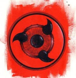
Post by Iruna Nakara on Aug 13, 2013 9:59:45 GMT -6
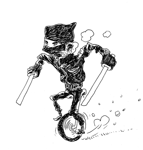
 this is the Tori Tori no Mi-Model:Falcon Full Transformation below is the fruit this is the Tori Tori no Mi-Model:Falcon Full Transformation below is the fruit
 |
|
|
|
Post by Jordanland on Aug 15, 2013 19:11:26 GMT -6
Why should I shut up? He wants opinions, the icons are bad, that's it. Is it my fault? Cmon baby. You are always talking bullshit about Dean and many other people you don't like, I have the rights to do the same with the people I dislike, or atleast I think so. You did not give him any advise on how to improve the icons you only insulted him....if you're going to be a dick atleast be a helpful dick |
|
Jared
Ninja Academy Student

Posts: 29 
|
Post by Jared on Aug 16, 2013 1:34:28 GMT -6
i like this bird, but something about his wings throws me off. i have no clue what show/manga/mind this comes from tho so idk |
|
|
|
Post by Jordanland on Aug 16, 2013 6:03:19 GMT -6
this is the Tori Tori no Mi-Model:Falcon Full Transformation below is the fruit
The shading on this icon looks a lot better and its not as blocky as the first icons although you might want to redo the feet since it just stands out from the rest of the icon |
|
|
|
Post by Iruna Nakara on Aug 16, 2013 7:50:49 GMT -6
Yeah this icon toke me a while but the feet I fixed but what toke me the most was the wings since I added such detail because of my mentor
|
|
|
|
Post by Sefirosu on Aug 16, 2013 8:20:45 GMT -6
Iruna, not to be a cynic, but the shading on the bird suggests it was done by someone else. There's virtually no shading on the original icons you posted (a critique I was going to make, but Thurnis' hate derailed my train of thought). And this bird has exceptionally well done shading.
|
|
|
|
Post by Sefirosu on Aug 16, 2013 8:23:22 GMT -6
I should also add coloring style. The bird has very natural hues of brown, which makes it look very..... 'realistic'. It's colored how a bird should be colored. But the original icons you posted were colored very differently. The colors used were very.... how do I word it. They were very POP. The colors used were bright, contrasting each other, and look very cartoony.
|
|
|
|
Post by NoshiFox \(-_-)z on Aug 16, 2013 14:21:45 GMT -6
He's been getting iconning lessons from Qua.
|
|
|
|
Post by Iruna Nakara on Aug 16, 2013 17:09:33 GMT -6
Yeah sefi it dose look odd that I jumped from 1 stage to like the 5th its all thanx to Quat he opened my eyes to what I really needed to focus on witch is details and animalistic's of the falcon with lead to my current iconing skill
|
|
TRVPLXRD THURNIS
ROOT
Couple A B C's, bad bitch double D's poppin' E's I don't give a F told ya am a G
Posts: 514
|
Post by TRVPLXRD THURNIS on Aug 16, 2013 17:40:26 GMT -6
I guess that's why your english is as bad as his.
Nah joke, the bird looks good.
|
|
|
|
Post by Matt on Aug 17, 2013 2:35:44 GMT -6
I mean, Iruna if you gain skill that quickly I'm hella impressed O.o keep up the good work, might I suggest going back over your old icons and touching them up with what you learned?
|
|
|
|
Post by Sefirosu on Aug 20, 2013 15:43:40 GMT -6
If your current skill is where the bird is at, why did you ask for opinions on how your old icons looked, rather than how your current icons are?
|
|
|
|
Post by Iruna Nakara on Aug 20, 2013 16:59:25 GMT -6
Matt I will eventually but iam working on two big projects and i am swamped so I will when I get time
|
|
|
|
Post by Iruna Nakara on Apr 21, 2014 17:44:05 GMT -6
Mehh was board not the best i got right now but w.e 
|
|


 {Hidden Cloud} - {Fatboy Barry} : Noshi nobody has to force you to smoke weed, lol